Nairobeans Branding, Packaging & Website
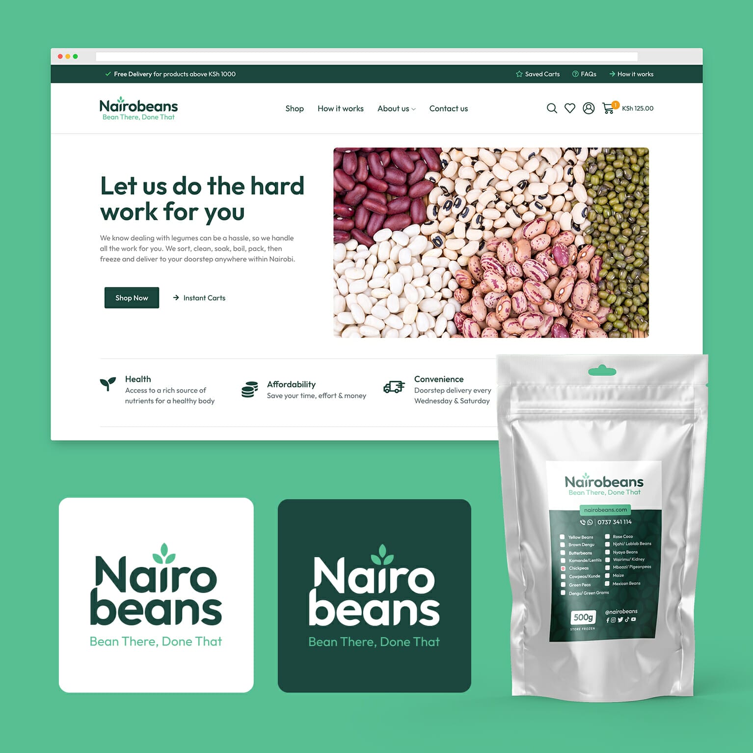
The project involved refreshing and refining the brand, designing new packaging labels, and creating a new website with a focus on user experience and convenience. The updated brand included a new logo with two shades of green that represent the freshness and healthiness of legumes, as well as the company’s commitment to sustainability and the environment.
The customized font used in the logo was chosen to give the brand a distinct personality and to make it easily recognizable. The font is modern and bold, yet friendly and approachable, while also conveying a sense of warmth and familiarity.
The packaging label features a well-organized layout with clear and concise information. The new website offers features such as saved carts, minimum order amounts, free shipping, and a recipe section, providing a seamless shopping experience for customers. These updates were aimed at elevating the brand to new heights while still maintaining its unique essence and improving customer satisfaction.
PROJECT
Nairobeans Website
CLIENT
Nairobeans
DATE
March 2023
CATEGORY
Website Design
WEBSITE LINK

